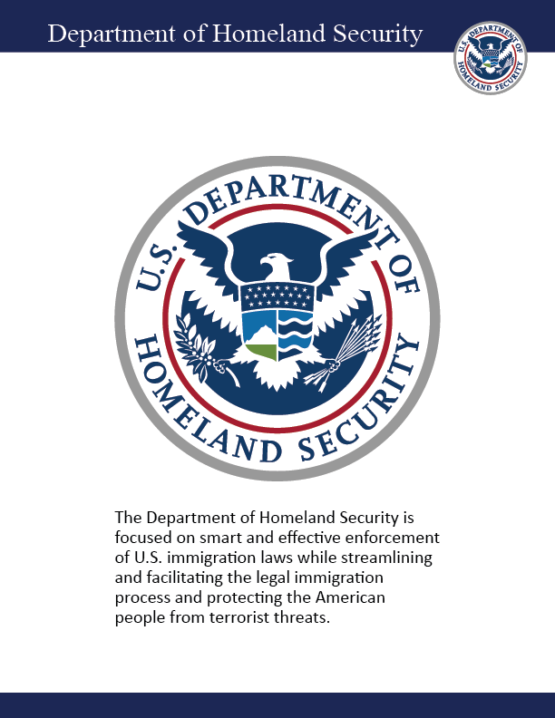
Department of Homeland Security
The Department of Homeland Security is focused on smart and effective enforcement of U.S. immigration laws while streamlining and facilitating the legal immigration process and protecting the American people from terrorist threats.
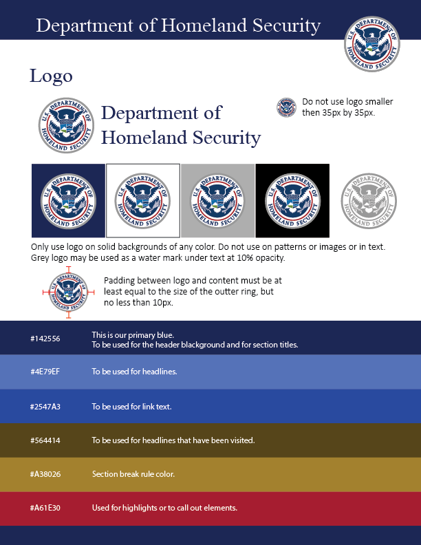
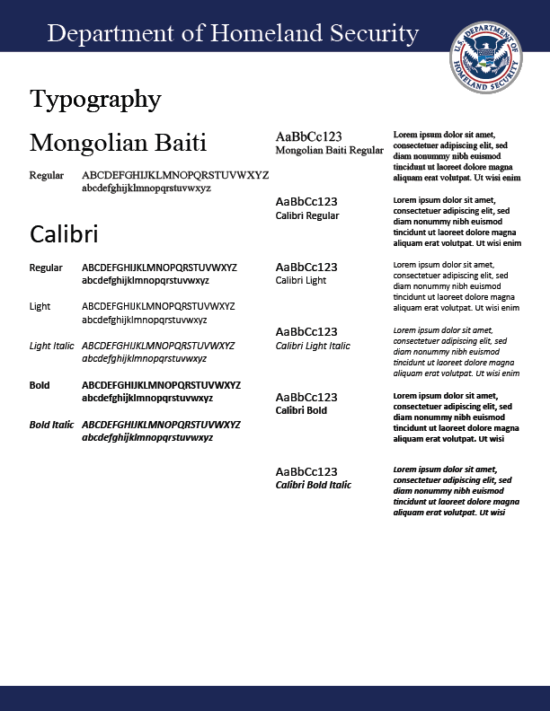
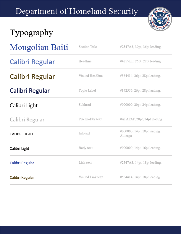
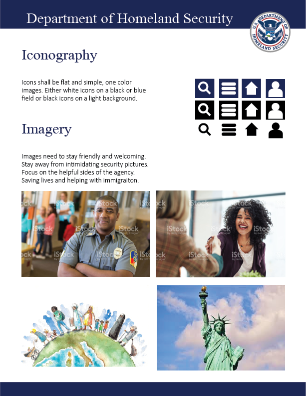
DHS has a serious branding issues. Negative news stories and policies have had a detrimental impact on the agency’s reputation. This styleguide is meant as a branding adjustment to focus on the positive aspects of the Department of Homeland Security.